Siteguru
How SiteGuru's Revenue Jumped 30% Without Changing What The Product Could Do.
Simplifying complex data without losing any of the capability underneath.

+30%
Revenue post redesign
Higher
Trial to paid conversions
4.8
User rating on G2
The challenge
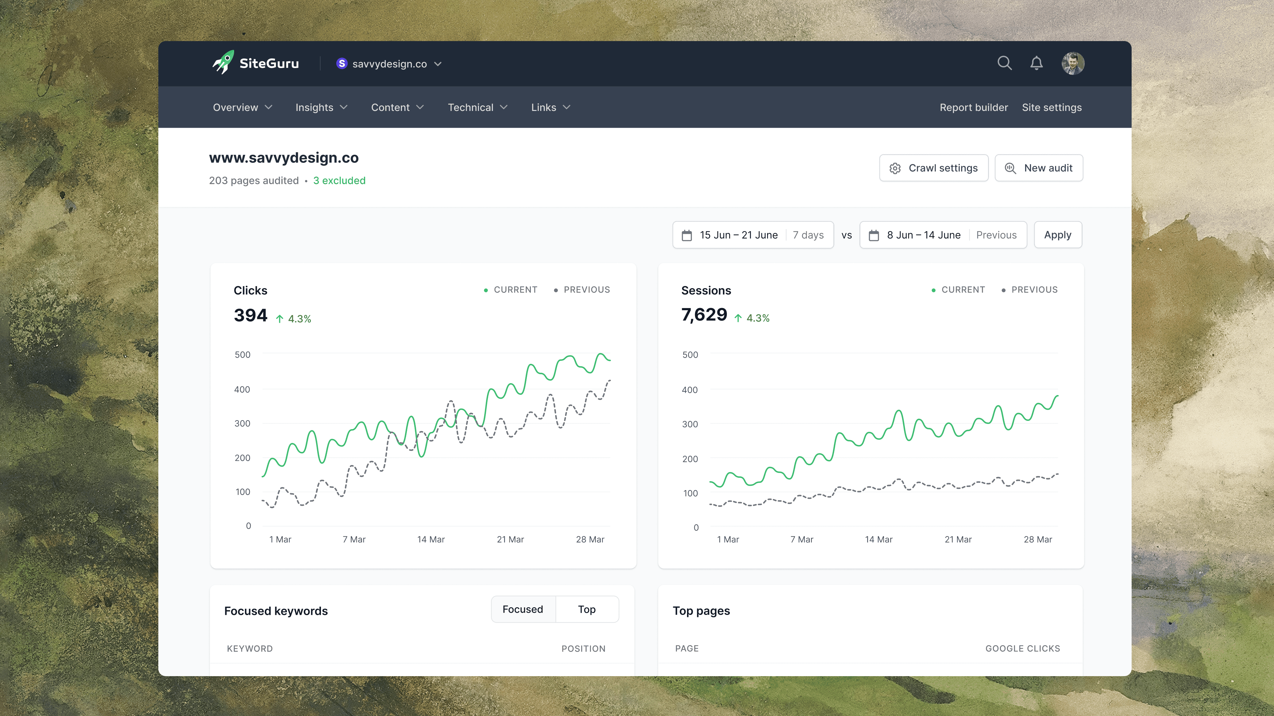
SiteGuru is an SEO tool built for people who aren't SEO experts. Audit your site, get a prioritised to-do list, work through it, improve your rankings. That was the promise. The product was technically capable, but it was bloated, dense with complex data, and the team hadn't yet solved the bit that mattered most for their users, presenting that data in a way a non-expert could actually use.
The result was a product undermined by its own interface. Trial users hit a wall of jargon before they reached anything useful, time-to-value was slow, and conversions suffered. The simplicity SiteGuru was selling couldn't actually be felt by anyone using it.
The approach
Across 3 separate engagements, I worked with the team to take complex SEO data and make it feel easy to understand and simple to use. The work started the same way every time. Go deep on what the user actually needed to do with the data, what was getting in the way, and what could be cut. Then designs that fit the product, shipped quickly.
Work spanned the dashboard, navigation, onboarding, the report builder, keyword clusters, the page and indexation reports, and the SEO timeline. It was about deciding what each user needs to see first, then designing the experience around that.
The outcome
Revenue rose 30% in the month following the redesign launch. Trial-to-paid conversions improved as new users hit value faster, and SiteGuru built a reputation in the market for being the simple SEO tool, despite handling some of the most complex data in the category. The product now sits at 4.8/5 on G2 from over 200 users, and has been awarded "Most Easy-to-Use SEO Tool" on both G2 and Capterra.
All of this came from making the product feel lighter. The capability didn't change but how users felt about it did.


Lesson
Simple isn't a visual style. It's a structural decision about what to show, when, in what order, and what to leave out. SiteGuru's data was always there, the product just needed to stop putting all of it in front of every user at once.
You can't make a complex tool feel simple by tidying it up. You have to decide what each user needs to see at each moment, then strip the experience back to that. Do that well and your interface stops competing with your value, it starts delivering it.