SendX
How a Ground-up Redesign Grew SendX Conversions 25% and Doubled ACV.
A feature-rich email marketing platform was losing users before they saw the value. Here's how we closed the gap.

25%
Increase in paid conversions
2x
Mid-market annual growth
4.6
User rating on Capterra
The challenge
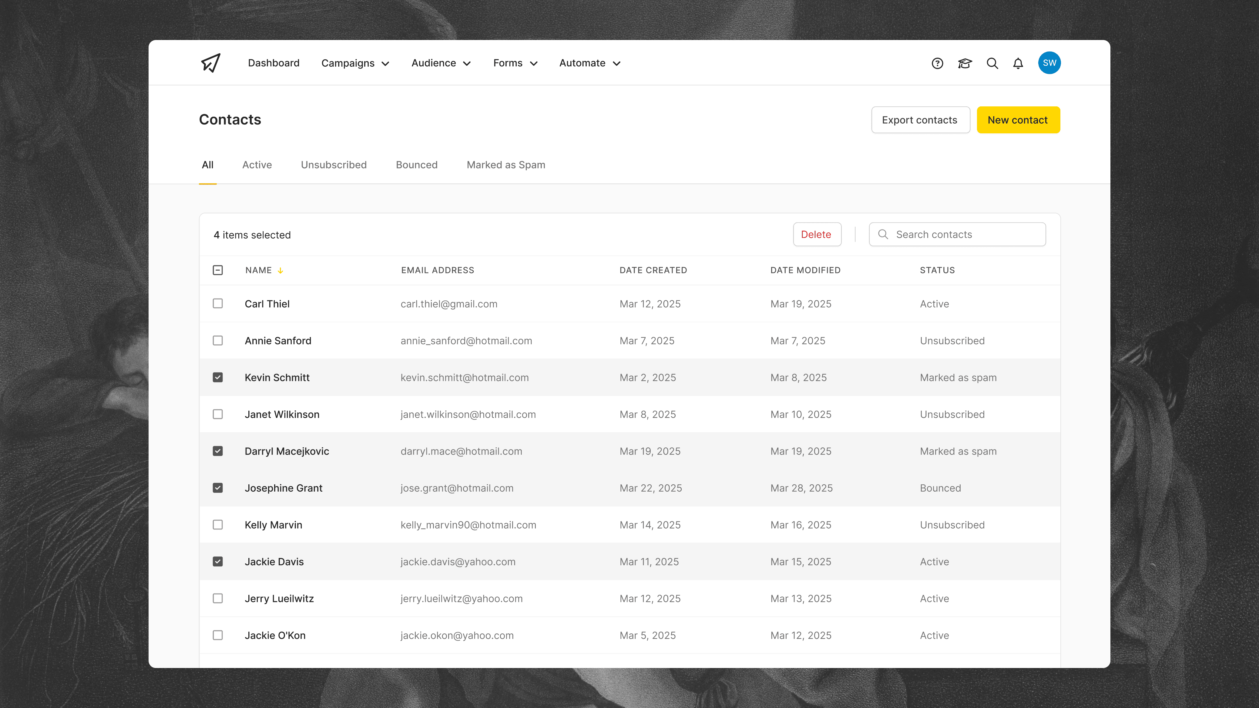
SendX is an email marketing platform built for B2B companies and serious bloggers. But like a lot of products built by a team that knows its domain inside out, the capability had run ahead of the experience. The UI was outdated and confusing, and the power was all there, it just wasn't obvious.
New users had a steep learning curve to climb before they saw enough to want to stick around, and for existing accounts, half the product went unused because the deeper features stayed hidden behind that same curve. As a result, trials leaked, and accounts they'd already won never grew into what they should be.
The approach
Over 17 months I worked embedded with the team and redesigned the product from the ground up, modernising a tired interface and rebuilding the flows underneath it, but not in one big risky relaunch. Wherever we could, we let user feedback and data lead, so the bigger calls were informed rather than guesses.
We shipped small, calculated design changes that each solved one user problem at a time, which kept the product stable while it steadily got clearer and easier to use. Alongside that we introduced genuinely valuable features for users, including segments, workflow builder, global search, and AI insights, so the product gave people a reason to go deeper and expand their account.
The outcome
Paid conversions rose 25% on the existing baseline, and mid-market ACV doubled, the accounts worth the most, growing the most. Underneath those headline numbers, the team could ship and validate ideas faster, and the product became genuinely easier to learn, easier to use day to day, and easier to expand within an account. It also finally looked like a product worth paying for, which matters more than founders like to admit when a prospect is comparing three tools side by side.
That last point is what drives both numbers at once. People who can find the value buy, and people who feel in control spend more. The product now sits at 4.6/5 on Capterra.

Lesson
Feature-rich and valuable aren't the same thing. SendX already had the capability, more of it than most of the market, so the win was cutting the distance to what was already there and making the product look the part while we did it.
That's the thing founders building powerful products tend to miss. When you know your own tool well enough, the learning curve is invisible, and so is the dated UI you've stopped noticing, but your users feel it, and most don't make it far enough to find out how good the product actually is. Close that gap and you don't just win more trials. You turn the value you'd already built into revenue.
