BROKER BUDDHA
Redesigned core workflows to increase engagement and customer satisfaction
Client results
Increased engagement across redesigned features
driven by clearer workflows that consistently outperformed previous versions in testing.
4.6 / 5.0 'ease of use' score from Capterra reviews
based on feedback from users.
96% of users would recommend the product
thanks to a more intuitive and user-friendly experience.
Background
Broker Buddha is a digital platform that helps insurance agencies streamline applications and renewals. But without an in-house designer, the team was making critical UX decisions based on assumptions. Core workflows like the dashboard, application builder, and contact management felt clunky and underused. As the company replatformed and looked to scale, the lack of design clarity was holding them back, limiting engagement, confusing users, and making it harder to deliver new features.
Broker Buddha in a nutshell
Problems
Solutions
No in-house design expertise
Product decisions were made without UX training or structured input.
UX led by data, not guesswork
User feedback and client interviews informed better design decisions.
Underused core features
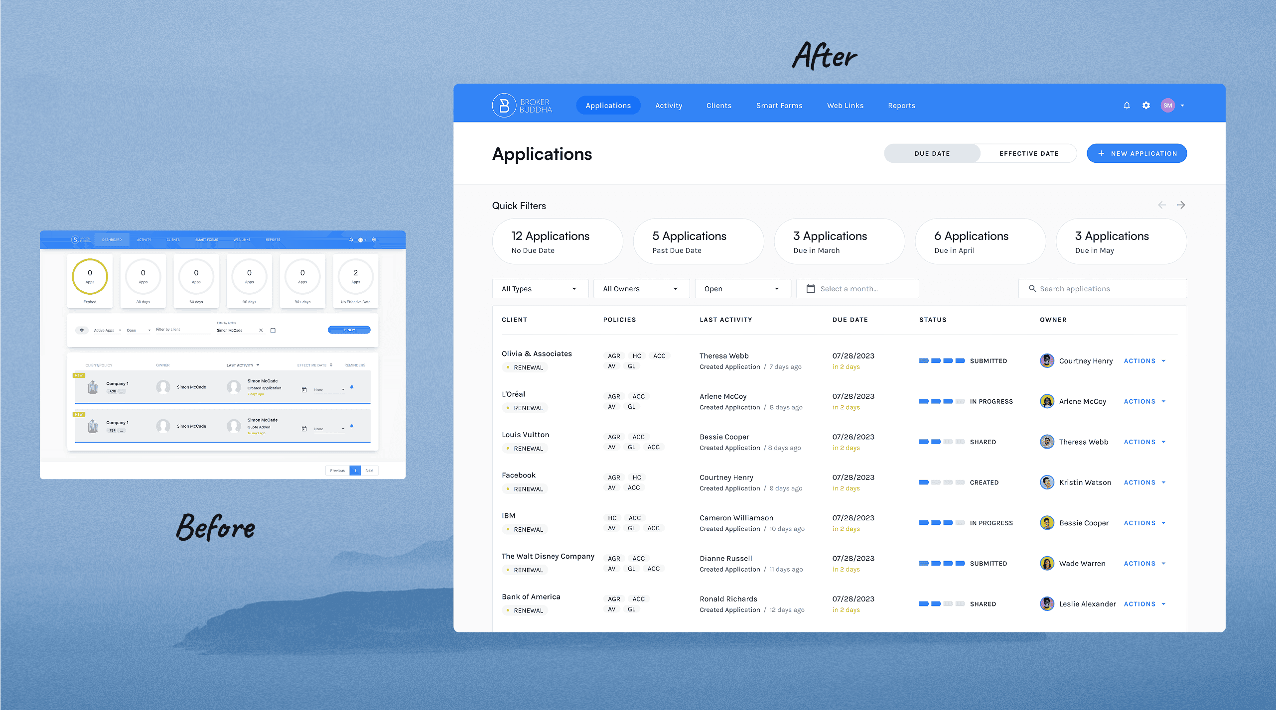
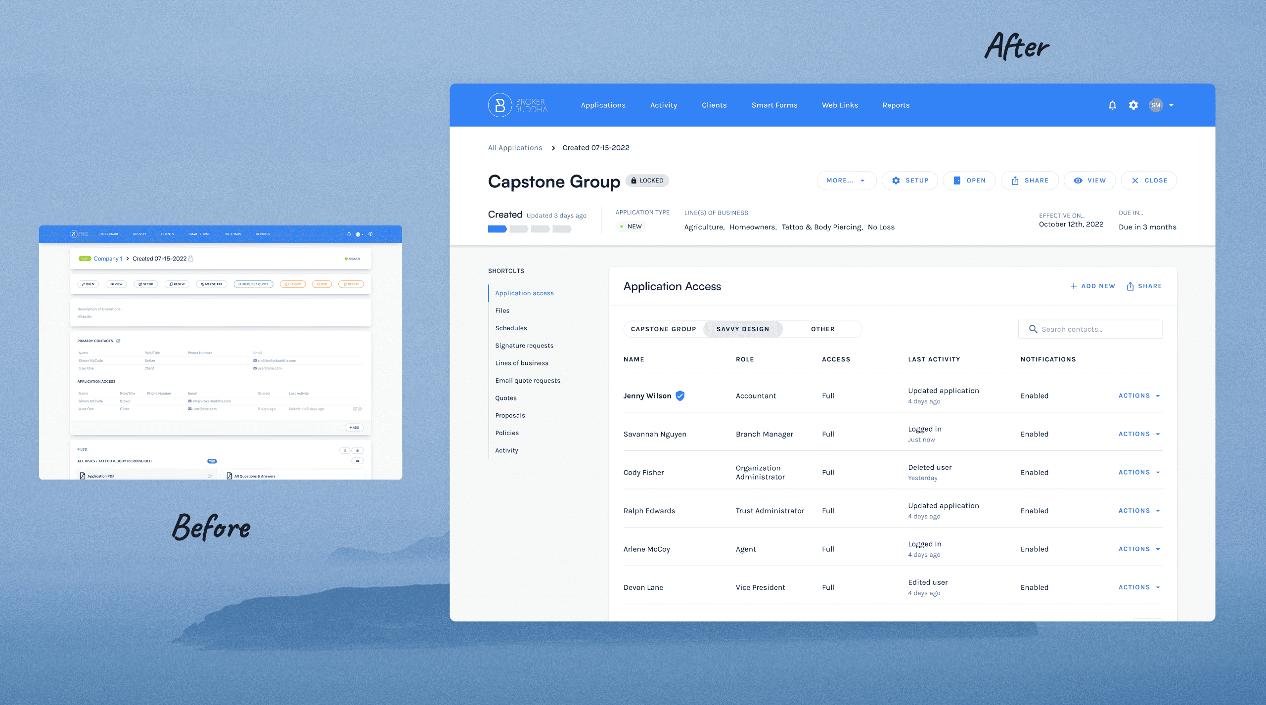
Important features like the application dashboard and builder were overlooked by users.
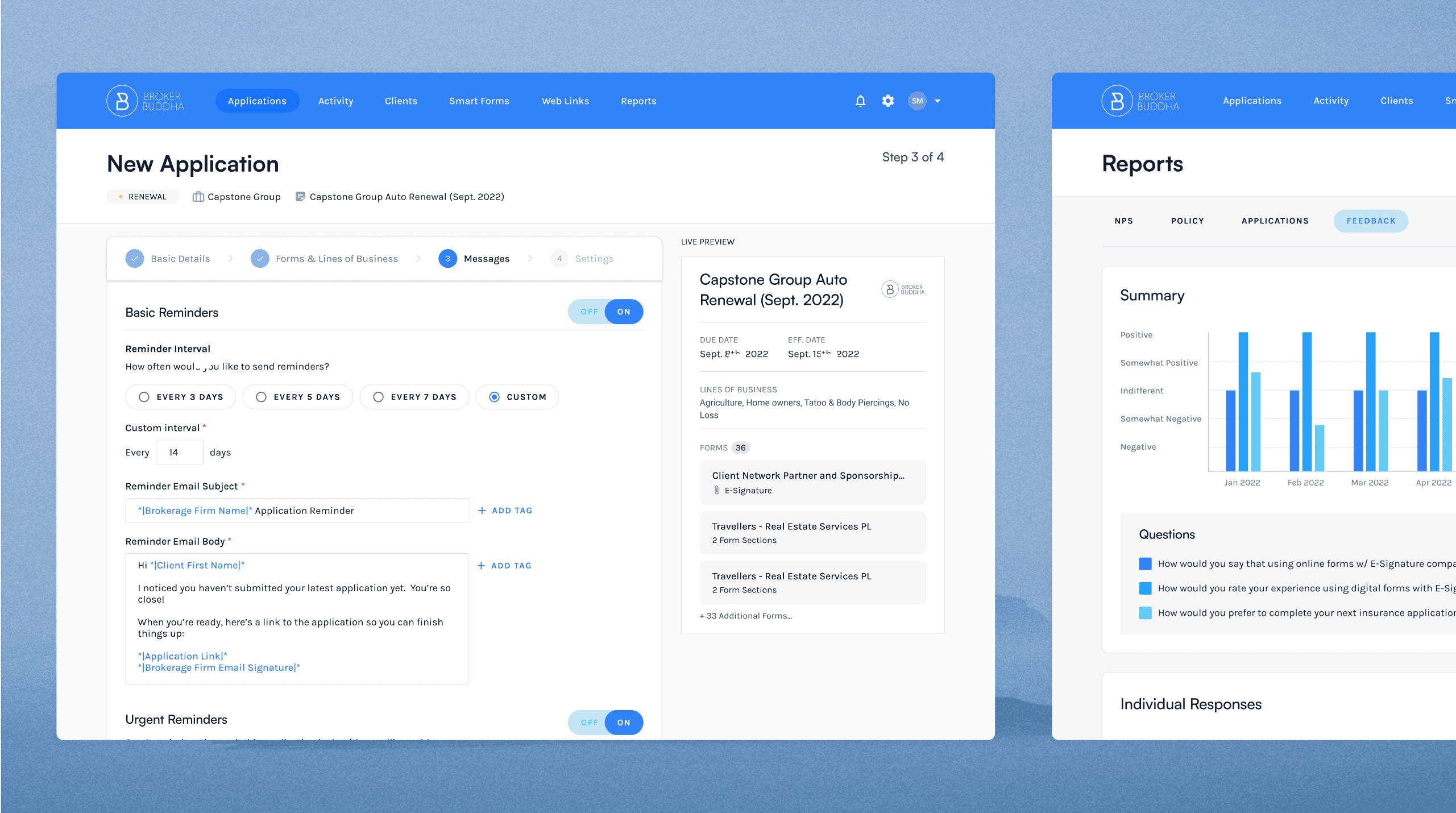
Increased engagement across core workflows
Redesigns made features clearer, easier to use, and more valuable.
Outdated, inconsistent interface
The UI felt clunky, visually fragmented, and difficult to maintain.
Modern, cohesive product experience
A modern, unified experience was delivered using Material Design to boost usability and visual consistency.
Design changes slowed by technical constraints
Technical debt made it hard to introduce new UX improvements.
Flexible design that fit real-world engineering limits
Designs were delivered with engineering constraints in mind to avoid delays.
Limited team capacity during replatforming
The team was mid-replatform with limited bandwidth for UX.
Design that supported delivery through complexity
Redesigns were scoped and prioritised to ship alongside infrastructure changes.
Key takeaways
Clearer UX improved feature adoption
Redesigned workflows made core features easier to find, use, and value.
Faster, smarter product decisions
Design direction was guided by real client feedback, not internal assumptions.
Reduced delivery risk during a complex replatform
Designs aligned with engineering constraints to avoid delays and bottlenecks.
Stronger design foundation for future growth
Material Design brought consistency and scalability to support long-term product evolution.
Testimonial was recorded during my time as SavvyDesign, the agency I previously ran before rebranding under my own name.
"Everything we show from Simon is preferred over what we have today"
“Partnering with Simon transformed our platform. His designs improved client engagement, revived underused features, and introduced new ones that users love. Despite complex challenges, he designed intuitive, buildable solutions while working seamlessly with our tech team. For any startup navigating change, I highly recommend him.”
-2.png)
Aaron Shrensel
Product manager, Broker Buddha
Tired of your SaaS product leaking revenue?
