SITE GURU
Helped an SEO tool grow revenue 30% with a cleaner, easier-to-use interface
Client results
30% increase in revenue after redesign
driven by a cleaner, more consistent UX made the product easier to use
Higher trial-to-paid conversions
thanks to a simplified the user onboarding and first-use experience.
4.8 / 5.0 rating on G2 rating from 200+ users
achieved through improved usability and visual clarity.
Background
SiteGuru is an SEO tool that helps marketers and website owners improve their site’s performance by finding and fixing SEO issues. With a clear focus on simplicity and ease of use, the team built a strong reputation in a space dominated by overly complex tools. But after years of shipping new features, the product had become bloated and hard to evolve. They needed a fresh design system, a more scalable interface, and a simpler user experience, without losing what made the tool approachable in the first place.
Site Guru in a nutshell
Problems
Solutions
Product felt bloated after years of growth
Years of feature releases made the app harder to navigate and extend.
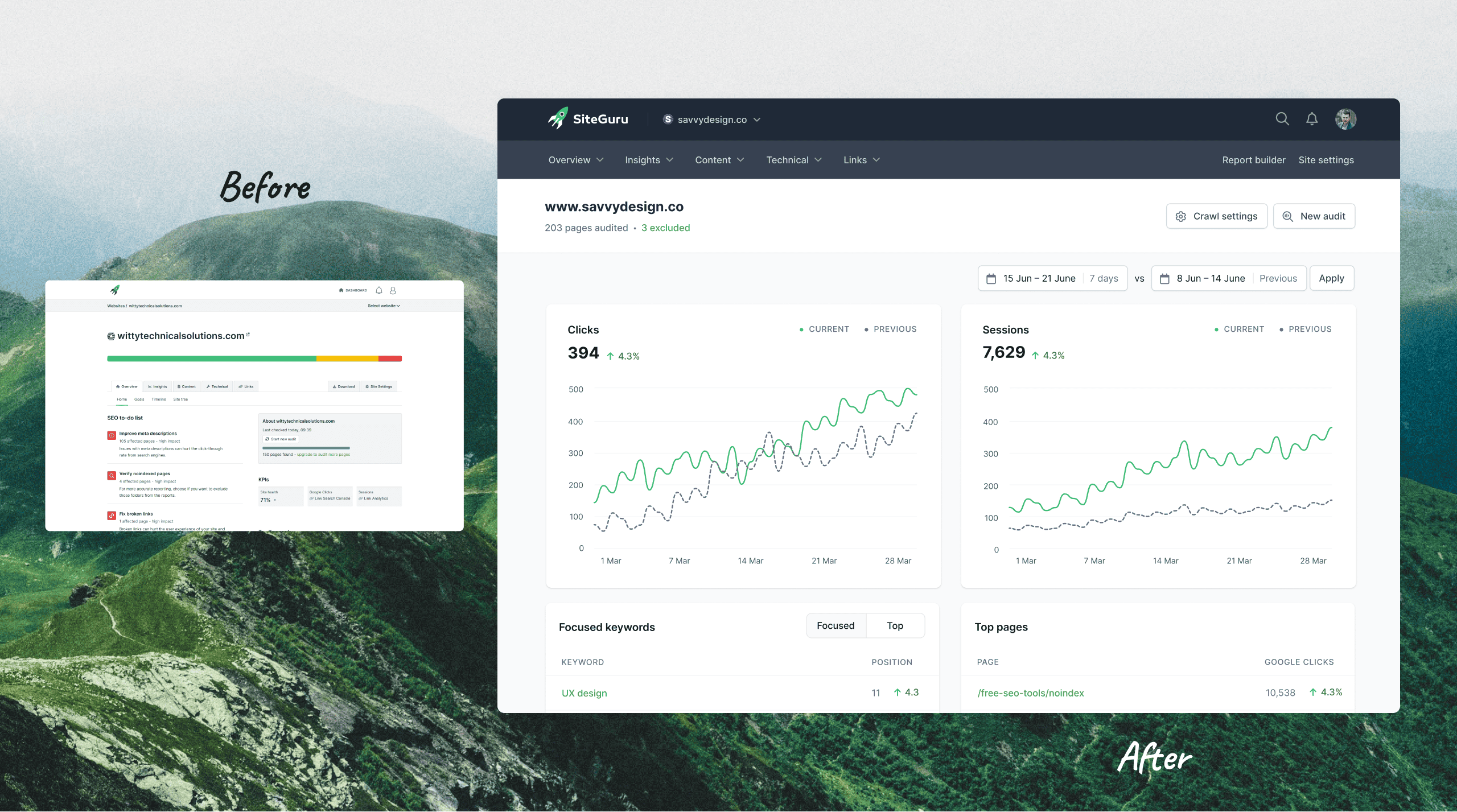
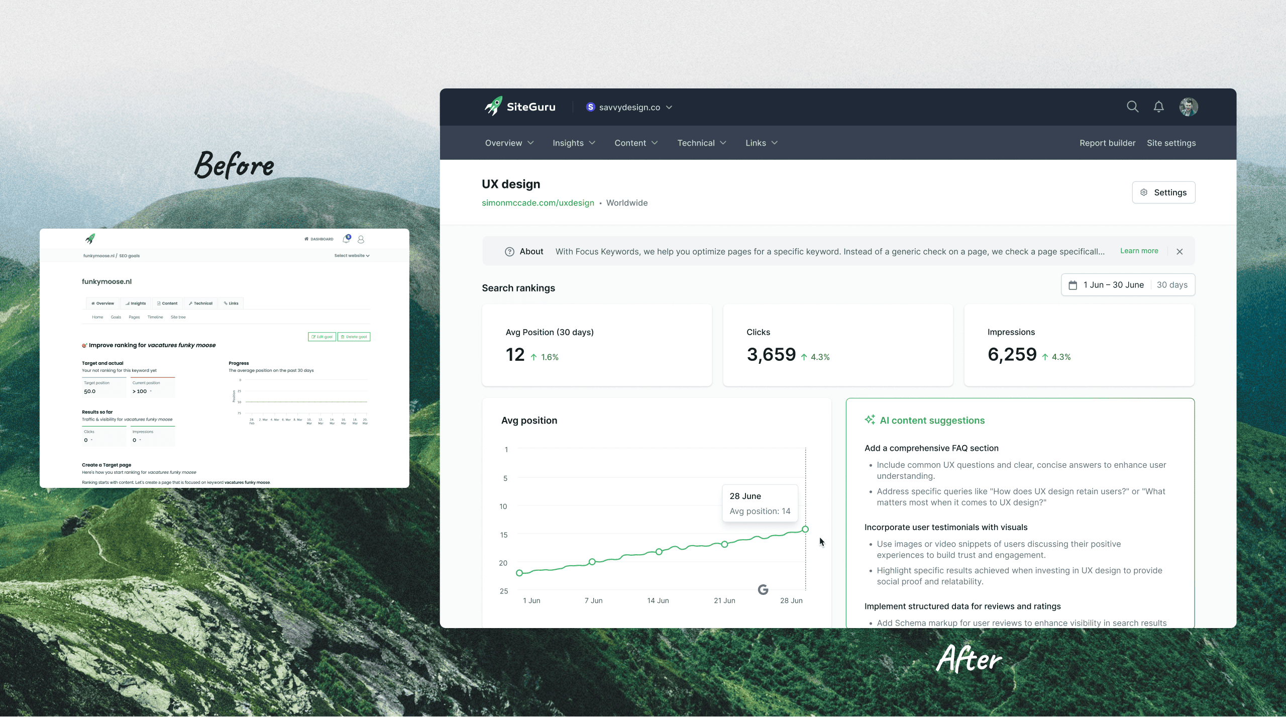
Cleaner, more scalable UX foundation
A refreshed structure made the product easier to use and easier to grow.
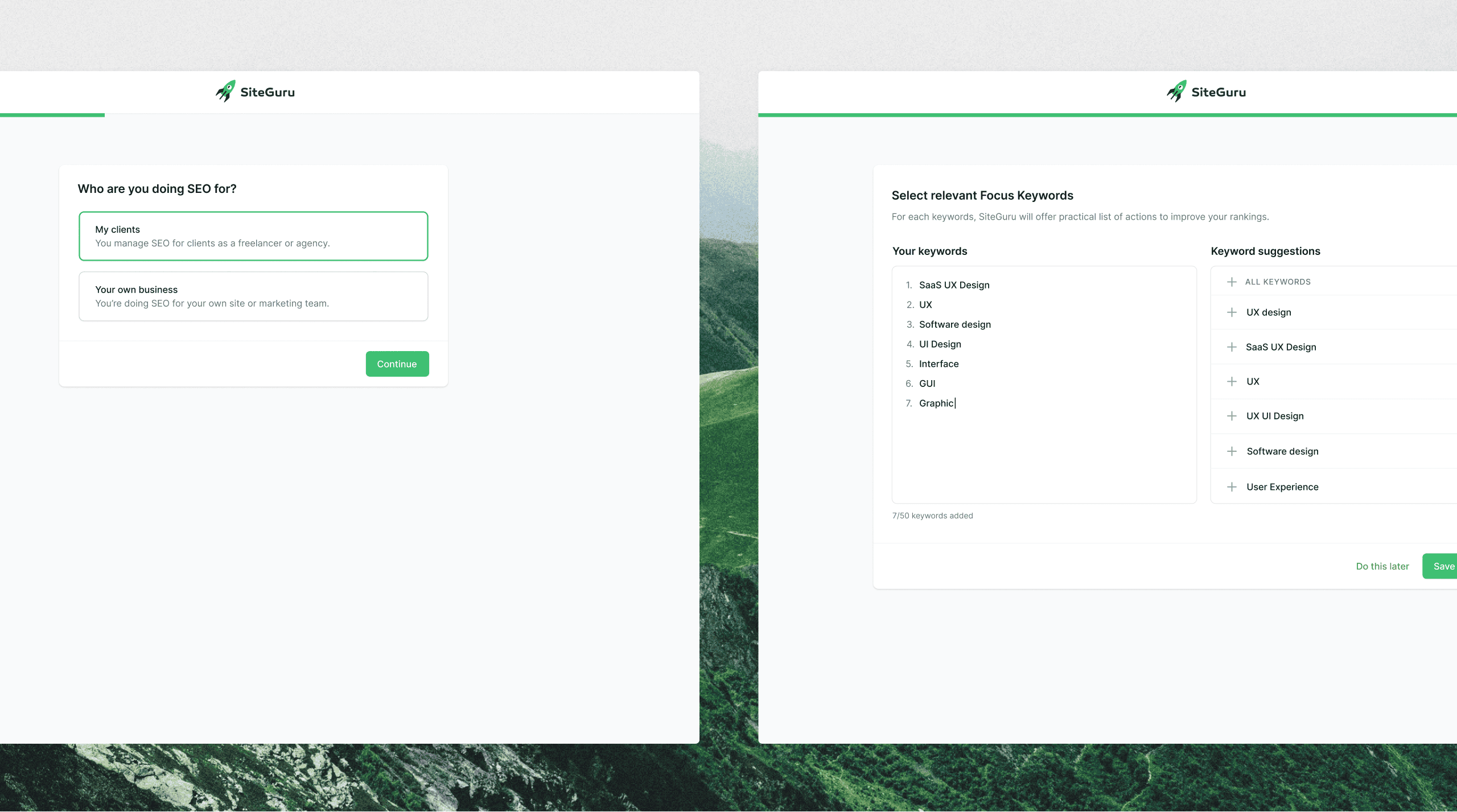
Disjointed onboarding slowed user activation
New users had a hard time understanding where to start or what to do.
Onboarding that drives key SEO setup actions
The new flow prompts users to connect Google Search Console and define SEO goals, improving activation and long-term value.
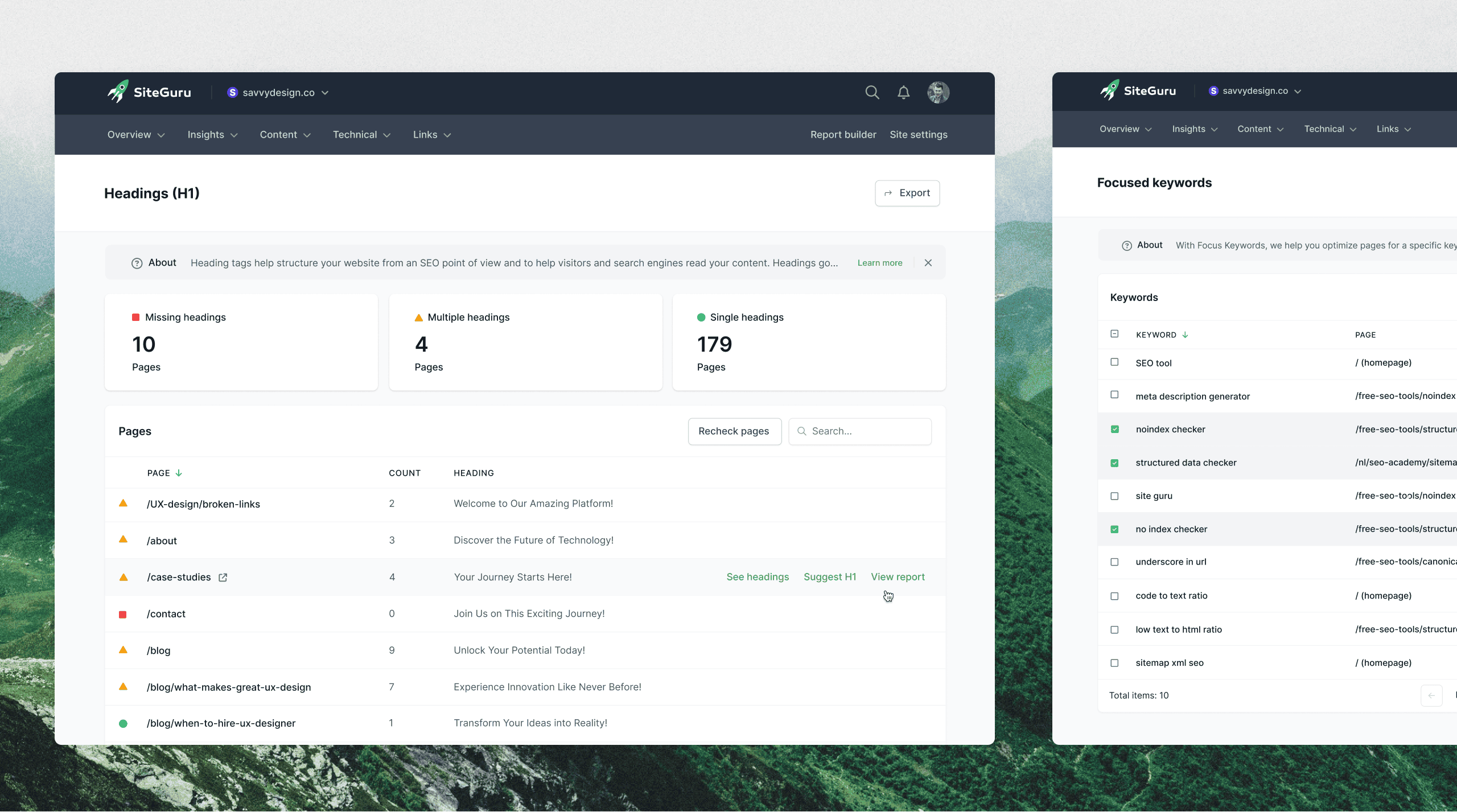
Navigation was cluttered and hard to scale
Key features were buried inside tabs within tabs, making them hard to find.
Simplified navigation built for future growth
A restructured navigation system surfaced important tools and made the app easier to explore.
Visual inconsistency across the platform
Layouts and styles varied from screen to screen.
Cohesive UI that improves usability and trust
A cohesive system brought clarity and consistency across the app.
Design work slowed decision-making and delivery
Slow iterations made it harder to maintain momentum.
Faster design cycles kept the team moving
Quick turnarounds allowed for faster feedback and alignment.
Key takeaways
30% revenue growth through better UX
Improved clarity and usability led to more conversions and higher customer retention.
Simpler onboarding improved early activation
New users were guided to complete core actions like adding keywords and setting SEO goals.
Navigation redesigned for clarity and scale
Core features were surfaced, making the product easier to explore and expand.
Redesign triggered positive user feedback
Customers reached out unsolicited to praise the cleaner, easier-to-use experience.
"Within a month of launching the redesign, our revenue increased by 30%"
"Simon helped turn a bloated, complex product into something simple, consistent, and easy to use. Within a month of the redesign, our revenue jumped 30%.
His work has been key to us winning ‘Most Easy-to-Use SEO Tool’ on G2 and Capterra."
His work has been key to us winning ‘Most Easy-to-Use SEO Tool’ on G2 and Capterra."

Rick van Hassteren
Owner, Site Guru
Ready to improve what's working, fix what isn't, and grow faster?
